
[fusion_builder_container background_color=”” background_image=”” background_parallax=”none” enable_mobile=”no” parallax_speed=”0.3″ background_repeat=”no-repeat” background_position=”left top” video_url=”” video_aspect_ratio=”16:9″ video_webm=”” video_mp4=”” video_ogv=”” video_preview_image=”” overlay_color=”” overlay_opacity=”0.5″ video_mute=”yes” video_loop=”yes” fade=”no” border_size=”0px” border_color=”” border_style=”” padding_top=”20″ padding_bottom=”20″ padding_left=”0″ padding_right=”0″ hundred_percent=”no” equal_height_columns=”no” hide_on_mobile=”no” menu_anchor=”” class=”” id=””][fusion_builder_row][fusion_builder_column type=”1_2″ last=”no” spacing=”yes” center_content=”no” hide_on_mobile=”no” background_color=”” background_image=”” background_repeat=”no-repeat” background_position=”left top” hover_type=”none” link=”” border_position=”all” border_size=”0px” border_color=”” border_style=”solid” padding=”” margin_top=”” margin_bottom=”” animation_type=”0″ animation_direction=”down” animation_speed=”0.1″ animation_offset=”” class=”” id=””][fusion_imageframe lightbox=”no” lightbox_image=”” style_type=”none” hover_type=”none” bordercolor=”” bordersize=”0px” borderradius=”0″ stylecolor=”” align=”none” link=”” linktarget=”_self” animation_type=”0″ animation_direction=”down” animation_speed=”0.1″ animation_offset=”” hide_on_mobile=”no” class=”” id=””]  [/fusion_imageframe][fusion_separator style_type=”shadow” top_margin=”30″ bottom_margin=”30″ sep_color=”#fd0404″ border_size=”” icon=”fa-download” icon_circle=”” icon_circle_color=”” width=”” alignment=”center” class=”” id=””/][fusion_text]
Small businesses make up most of the cogs that keep society moving. Every successful business provides something of value and this is especially true of small businesses. The proof is in the pudding but an image of success goes beyond reputation and can be sewn into a company’s branding.
Large corporate sites often lean towards stuffy layouts but small businesses can have a more personal approach. I’ve collected a handful of design trends perfect for small business websites. Whether you’re designing for a taxidermist or a dermatologist, these trends can be applied to any business website to create a stronger layout and digital identity.
[/fusion_text][/fusion_builder_column][fusion_builder_column type=”1_2″ last=”yes” spacing=”yes” center_content=”no” hide_on_mobile=”no” background_color=”” background_image=”” background_repeat=”no-repeat” background_position=”left top” hover_type=”none” link=”” border_position=”all” border_size=”0px” border_color=”” border_style=”” padding=”” margin_top=”” margin_bottom=”” animation_type=”” animation_direction=”” animation_speed=”0.1″ animation_offset=”” class=”” id=””][fusion_title size=”3″ content_align=”left” style_type=”default” sep_color=”” margin_top=”” margin_bottom=”” class=”” id=””]Natural Content Structure[/fusion_title][fusion_text]
A website’s content is without a doubt the most important aspect. Content should be the primary focus and prove to be an easy read for visitors. A difficult content structure makes browsing the site difficult which in turn causes visitors to flee en masse.
Structured typography is developed through recognizable headers, paragraphs, and internal links. Distinguish important information with a larger font size and more space between blocks of text. Your goal should be to create easily consumable content. Visitors should be doing the least amount of work browsing a site to figure out what a company does.
[/fusion_text][fusion_separator style_type=”shadow” top_margin=”30″ bottom_margin=”30″ sep_color=”#fd0404″ border_size=”” icon=”fa-download” icon_circle=”” icon_circle_color=”” width=”” alignment=”center” class=”” id=””/][/fusion_builder_column][fusion_builder_column type=”1_1″ background_position=”left top” background_color=”” border_size=”” border_color=”” border_style=”solid” spacing=”yes” background_image=”” background_repeat=”no-repeat” padding=”” margin_top=”0px” margin_bottom=”0px” class=”” id=”” animation_type=”” animation_speed=”0.3″ animation_direction=”left” hide_on_mobile=”no” center_content=”no” min_height=”none”][fusion_separator style_type=”shadow” top_margin=”40″ bottom_margin=”40″ sep_color=”#fd0404″ border_size=”” icon=”fa-download” icon_circle=”” icon_circle_color=”” width=”” alignment=”center” class=”” id=””/][/fusion_builder_column][/fusion_builder_row][/fusion_builder_container][fusion_builder_container background_color=”” background_image=”” background_parallax=”none” enable_mobile=”no” parallax_speed=”0.3″ background_repeat=”no-repeat” background_position=”left top” video_url=”” video_aspect_ratio=”16:9″ video_webm=”” video_mp4=”” video_ogv=”” video_preview_image=”” overlay_color=”” overlay_opacity=”0.5″ video_mute=”yes” video_loop=”yes” fade=”no” border_size=”0px” border_color=”” border_style=”” padding_top=”20″ padding_bottom=”20″ padding_left=”0″ padding_right=”0″ hundred_percent=”no” equal_height_columns=”no” hide_on_mobile=”no” menu_anchor=”” class=”” id=””][fusion_builder_row][fusion_builder_column type=”1_1″ background_position=”left top” background_color=”” border_size=”” border_color=”” border_style=”solid” spacing=”yes” background_image=”” background_repeat=”no-repeat” padding=”” margin_top=”0px” margin_bottom=”0px” class=”” id=”” animation_type=”” animation_speed=”0.3″ animation_direction=”left” hide_on_mobile=”no” center_content=”no” min_height=”none”][fusion_imageframe lightbox=”no” lightbox_image=”” style_type=”none” hover_type=”none” bordercolor=”” bordersize=”0px” borderradius=”0″ stylecolor=”” align=”center” link=”” linktarget=”_self” animation_type=”0″ animation_direction=”down” animation_speed=”0.1″ animation_offset=”” hide_on_mobile=”no” class=”” id=””] 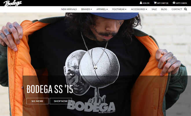 [/fusion_imageframe][fusion_separator style_type=”shadow” top_margin=”40″ bottom_margin=”40″ sep_color=”#fd0404″ border_size=”” icon=”fa-download” icon_circle=”” icon_circle_color=”” width=”” alignment=”center” class=”” id=””/][fusion_text]
One live example on Bodega is both practical and imitable for eCommerce design. The dropdown navigation is pretty straightforward using clear links and crisp text. Heavy contrast is found in all areas where text needs to jump off the page.
Each page header is especially interesting because photos are used to summarize content. Text and photos together can visually describe the value offered by a company.
[/fusion_text][/fusion_builder_column][/fusion_builder_row][/fusion_builder_container][fusion_builder_container background_color=”” background_image=”” background_parallax=”none” enable_mobile=”no” parallax_speed=”0.3″ background_repeat=”no-repeat” background_position=”left top” video_url=”” video_aspect_ratio=”16:9″ video_webm=”” video_mp4=”” video_ogv=”” video_preview_image=”” overlay_color=”” overlay_opacity=”0.5″ video_mute=”yes” video_loop=”yes” fade=”no” border_size=”0px” border_color=”” border_style=”” padding_top=”20″ padding_bottom=”20″ padding_left=”0″ padding_right=”0″ hundred_percent=”no” equal_height_columns=”no” hide_on_mobile=”no” menu_anchor=”” class=”” id=””][fusion_builder_row][fusion_builder_column type=”1_1″ background_position=”left top” background_color=”” border_size=”” border_color=”” border_style=”solid” spacing=”yes” background_image=”” background_repeat=”no-repeat” padding=”” margin_top=”0px” margin_bottom=”0px” class=”” id=”” animation_type=”” animation_speed=”0.3″ animation_direction=”left” hide_on_mobile=”no” center_content=”no” min_height=”none”][fusion_title size=”1″ content_align=”left” style_type=”default” sep_color=”” margin_top=”” margin_bottom=”” class=”” id=””]A Clean & Tidy Layout[/fusion_title][fusion_separator style_type=”shadow” top_margin=”40″ bottom_margin=”40″ sep_color=”#fd0404″ border_size=”” icon=”fa-download” icon_circle=”” icon_circle_color=”” width=”” alignment=”center” class=”” id=””/][fusion_imageframe lightbox=”no” lightbox_image=”” style_type=”none” hover_type=”none” bordercolor=”” bordersize=”0px” borderradius=”0″ stylecolor=”” align=”center” link=”” linktarget=”_self” animation_type=”0″ animation_direction=”down” animation_speed=”0.1″ animation_offset=”” hide_on_mobile=”no” class=”” id=””]  [/fusion_imageframe][fusion_separator style_type=”shadow” top_margin=”40″ bottom_margin=”40″ sep_color=”#fd0404″ border_size=”” icon=”fa-download” icon_circle=”” icon_circle_color=”” width=”” alignment=”center” class=”” id=””/][fusion_text]
When I think of clean layouts I don’t solely think of plain white minimalism.
Clean layouts are orderly. They’re fun to use because everything is easy to find. People new to the Internet should be able to figure out how to use the design in just a few seconds.
Seattle Caviar Co. is a very clean layout which also places a focus on contrasting elements. The nav menu immediately catches your attention and draws you further into the site. Each internal page section relies mostly on content and there’s not a lot of excess.
Some of their animations feel a little complicated and I feel the site would run cleaner without the fading effects. But paying strict attention to the layout itself, content is clearly king.
Orderly content is one major step toward a clean layout. You also need to consider general composition and how individual page elements relate to each other. When in doubt, extra space is often better than not enough space.
For comparison here are some business websites that don’t feel clean and might actually benefit from a redesign:
[/fusion_text][/fusion_builder_column][/fusion_builder_row][/fusion_builder_container][fusion_builder_container background_color=”” background_image=”” background_parallax=”none” enable_mobile=”no” parallax_speed=”0.3″ background_repeat=”no-repeat” background_position=”left top” video_url=”” video_aspect_ratio=”16:9″ video_webm=”” video_mp4=”” video_ogv=”” video_preview_image=”” overlay_color=”” overlay_opacity=”0.5″ video_mute=”yes” video_loop=”yes” fade=”no” border_size=”0px” border_color=”” border_style=”” padding_top=”20″ padding_bottom=”20″ padding_left=”0″ padding_right=”0″ hundred_percent=”no” equal_height_columns=”no” hide_on_mobile=”no” menu_anchor=”” class=”” id=””][fusion_builder_row][fusion_builder_column type=”1_1″ background_position=”left top” background_color=”” border_size=”” border_color=”” border_style=”solid” spacing=”yes” background_image=”” background_repeat=”no-repeat” padding=”” margin_top=”0px” margin_bottom=”0px” class=”” id=”” animation_type=”” animation_speed=”0.3″ animation_direction=”left” hide_on_mobile=”no” center_content=”no” min_height=”none”][fusion_title size=”1″ content_align=”left” style_type=”default” sep_color=”” margin_top=”” margin_bottom=”” class=”” id=””]Break Up Content with Photography[/fusion_title][fusion_separator style_type=”shadow” top_margin=”40″ bottom_margin=”40″ sep_color=”#fd0404″ border_size=”” icon=”fa-download” icon_circle=”” icon_circle_color=”” width=”” alignment=”center” class=”” id=””/][fusion_imageframe lightbox=”no” lightbox_image=”” style_type=”none” hover_type=”none” bordercolor=”” bordersize=”0px” borderradius=”0″ stylecolor=”” align=”center” link=”” linktarget=”_self” animation_type=”0″ animation_direction=”down” animation_speed=”0.1″ animation_offset=”” hide_on_mobile=”no” class=”” id=””]  [/fusion_imageframe][fusion_separator style_type=”shadow” top_margin=”40″ bottom_margin=”40″ sep_color=”#fd0404″ border_size=”” icon=”fa-download” icon_circle=”” icon_circle_color=”” width=”” alignment=”center” class=”” id=””/][fusion_text]
There’s only so much written copy that can be forced onto a small business webpage. Visitors just want to understand important info regarding what a company does, how much it costs, and where the company is located. Extra info is always nice but too much can be off-putting.
Instead veer towards photography to lighten the load. Custom photographs are perfect for a small business layout because they demonstrate a down-to-earth feel that you don’t always find on larger corporate sites.
The key is to use real photos of the company’s products, team members, or location.
For example The Coffee Trike is a very peculiar Java stand on wheels. They don’t have a whole lot of content, but the necessary content is important and clearly visible.
Their layout relies heavily on photos to demonstrate how The Coffee Trike works. It only takes a few seconds to fully grasp what it is. “Show don’t tell” can be taken literally in this case.
[/fusion_text][fusion_separator style_type=”shadow” top_margin=”40″ bottom_margin=”40″ sep_color=”#fd0404″ border_size=”” icon=”fa-download” icon_circle=”” icon_circle_color=”” width=”” alignment=”center” class=”” id=””/][fusion_imageframe lightbox=”no” lightbox_image=”” style_type=”none” hover_type=”none” bordercolor=”” bordersize=”0px” borderradius=”0″ stylecolor=”” align=”center” link=”” linktarget=”_self” animation_type=”0″ animation_direction=”down” animation_speed=”0.1″ animation_offset=”” hide_on_mobile=”no” class=”” id=””]  [/fusion_imageframe][fusion_separator style_type=”shadow” top_margin=”40″ bottom_margin=”40″ sep_color=”#fd0404″ border_size=”” icon=”fa-download” icon_circle=”” icon_circle_color=”” width=”” alignment=”center” class=”” id=””/][fusion_text]
Photographs are used to split up content sections while offering a peek into the café.
If you’re not much of a photographer it can be worth the money to hire a professional or grab some high-quality stock. One photo shoot doesn’t need to cost a lot and the company will have lots of PR pics to share on social media, too.
In the realm of small business websites imagery can be just as important as text. Especially for businesses that have physical locations and specialty products.
[/fusion_text][/fusion_builder_column][/fusion_builder_row][/fusion_builder_container][fusion_builder_container background_color=”” background_image=”” background_parallax=”none” enable_mobile=”no” parallax_speed=”0.3″ background_repeat=”no-repeat” background_position=”left top” video_url=”” video_aspect_ratio=”16:9″ video_webm=”” video_mp4=”” video_ogv=”” video_preview_image=”” overlay_color=”” overlay_opacity=”0.5″ video_mute=”yes” video_loop=”yes” fade=”no” border_size=”0px” border_color=”” border_style=”” padding_top=”20″ padding_bottom=”20″ padding_left=”0″ padding_right=”0″ hundred_percent=”no” equal_height_columns=”no” hide_on_mobile=”no” menu_anchor=”” class=”” id=””][fusion_builder_row][fusion_builder_column type=”1_1″ background_position=”left top” background_color=”” border_size=”” border_color=”” border_style=”solid” spacing=”yes” background_image=”” background_repeat=”no-repeat” padding=”” margin_top=”0px” margin_bottom=”0px” class=”” id=”” animation_type=”” animation_speed=”0.3″ animation_direction=”left” hide_on_mobile=”no” center_content=”no” min_height=”none”][fusion_title size=”1″ content_align=”left” style_type=”default” sep_color=”” margin_top=”” margin_bottom=”” class=”” id=””]Design with a Unique Style[/fusion_title][fusion_separator style_type=”shadow” top_margin=”40″ bottom_margin=”40″ sep_color=”#fd0404″ border_size=”” icon=”fa-download” icon_circle=”” icon_circle_color=”” width=”” alignment=”center” class=”” id=””/][fusion_imageframe lightbox=”no” lightbox_image=”” style_type=”none” hover_type=”none” bordercolor=”” bordersize=”0px” borderradius=”0″ stylecolor=”” align=”center” link=”” linktarget=”_self” animation_type=”0″ animation_direction=”down” animation_speed=”0.1″ animation_offset=”” hide_on_mobile=”no” class=”” id=””]  [/fusion_imageframe][fusion_separator style_type=”shadow” top_margin=”40″ bottom_margin=”40″ sep_color=”#fd0404″ border_size=”” icon=”fa-download” icon_circle=”” icon_circle_color=”” width=”” alignment=”center” class=”” id=””/][fusion_text]
Perhaps one of the most crucial elements to small business web design is the identity. This goes far beyond just a logo and includes symbols like icons, mascots, and even color schemes.
Small business websites should be designed to create a sense of familiarity with the company. Oftentimes this leads into custom styles like on The Drinkingbird Chicago example above.
A unique style works best when it melds nicely into the company’s goals and personality. Take for example Tavern Law which uses a 1920s Art Deco style.
Typography stands out and still gives that old school retro feeling. Everything is readable and the colors are crisp while still delivering a fancy atmosphere. This layout paints a picture of what to expect when visiting the tavern in person.
Not only does the design fit the style, but it relates in a historical significance. The tavern was founded back in the late 1800s and existed through the prohibition era. This brief twinge in history is now somewhat comical, but that era has left quite an imprint on the identity of this tavern.
[/fusion_text][fusion_separator style_type=”shadow” top_margin=”40″ bottom_margin=”40″ sep_color=”#fd0404″ border_size=”” icon=”fa-download” icon_circle=”” icon_circle_color=”” width=”” alignment=”center” class=”” id=””/][fusion_imageframe lightbox=”no” lightbox_image=”” style_type=”none” hover_type=”none” bordercolor=”” bordersize=”0px” borderradius=”0″ stylecolor=”” align=”center” link=”” linktarget=”_self” animation_type=”0″ animation_direction=”down” animation_speed=”0.1″ animation_offset=”” hide_on_mobile=”no” class=”” id=””]  [/fusion_imageframe][fusion_separator style_type=”shadow” top_margin=”40″ bottom_margin=”40″ sep_color=”#fd0404″ border_size=”” icon=”fa-download” icon_circle=”” icon_circle_color=”” width=”” alignment=”center” class=”” id=””/][fusion_text]
Luhse Tea is another example of strong unique design traits. The layout is dark and practically emblazons the film noir style. Plenty of noisy texture is used on the background and icons to give the old film look.
While Luhse Tea is more of an online retailer, their website feels like a small business layout following a very unique design. It’s a definitive example of how this style works on a niche business where the style may not thrive if plastered onto another website.
[/fusion_text][fusion_separator style_type=”shadow” top_margin=”40″ bottom_margin=”40″ sep_color=”#fd0404″ border_size=”” icon=”fa-download” icon_circle=”” icon_circle_color=”” width=”” alignment=”center” class=”” id=””/][/fusion_builder_column][/fusion_builder_row][/fusion_builder_container]